style guides
Lettering Tattoo Style Guide: Script, Fonts, and Longevity
A practical lettering tattoo style guide covering script fonts, line weight, placement, pricing, and how words age over a decade of skin.

Lettering looks like the easiest tattoo on the menu. It is usually the one clients regret first. A word or short phrase reads cleanly the day it is done, then the lines thicken, the counters fill in, and a delicate signature becomes a blurry block of black by year seven. The fix is not avoiding lettering. It is choosing a font, weight, size, and placement that survive the way skin actually behaves.
What lettering tattoos actually are
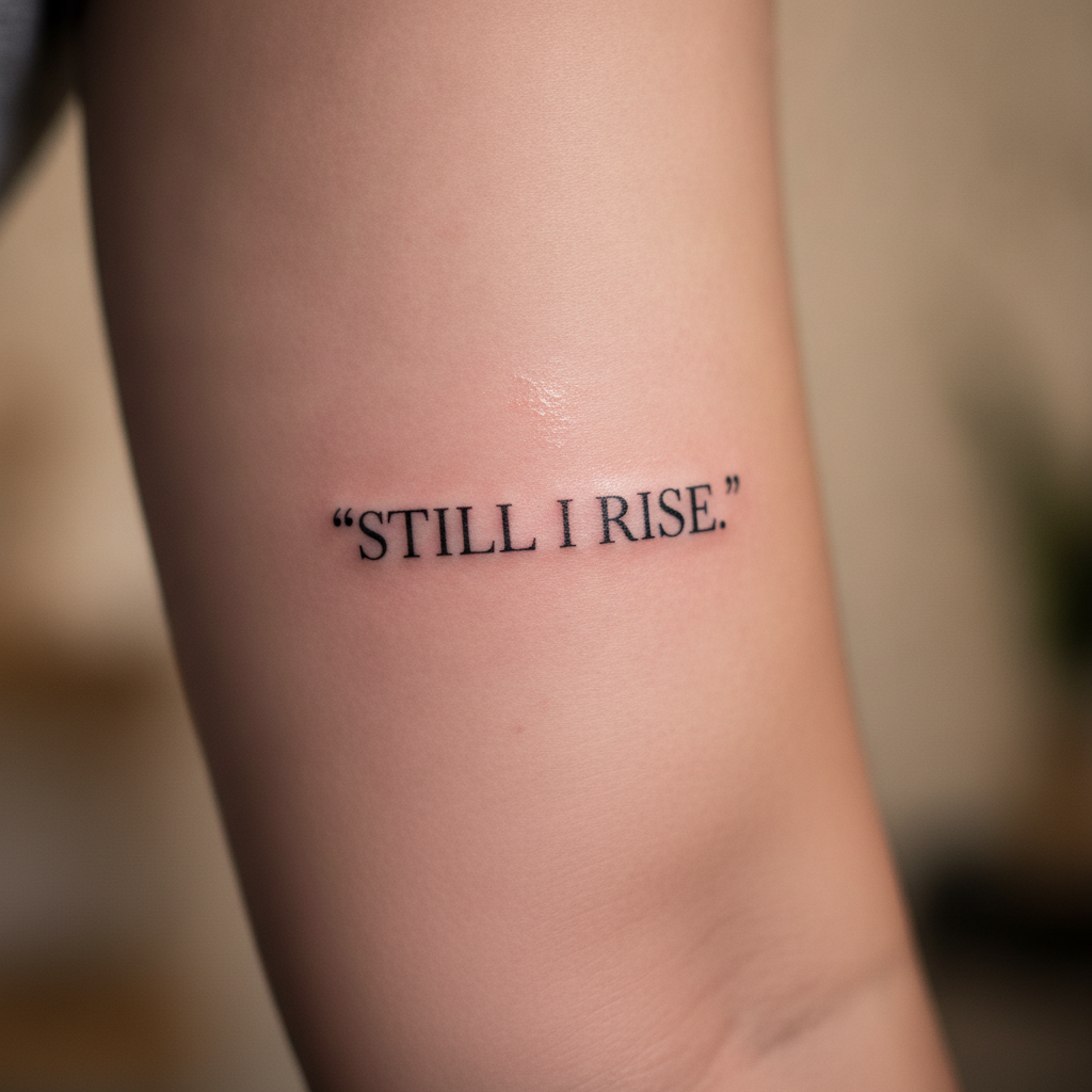
Lettering covers any tattoo whose primary subject is text. That includes single-word minimalist pieces, multi-line quotes, signatures, calligraphy, gothic blackletter, single-needle script, sailor-jerry style banners, and full chest or back manuscripts. The shared technical challenge is line consistency. A leaf or a rose can absorb a wobble. The letter "a" cannot. A 0.3 mm thickening of the bowl turns it into an "o," and a closed counter on a lowercase "e" turns it into a smudge.
Two style families dominate modern lettering. Fine-line script uses single-needle or 3RL groupings to produce thin, even strokes, usually black, often inspired by copperplate or modern calligraphy. Blackletter and serif lettering use heavier line weights, sometimes with bold filled strokes, and lean on the visual language of medieval manuscripts, gothic metal aesthetics, or Chicano placa work. Both can be beautiful. They age very differently, and the choice between them should be driven by placement and how you want the piece to read in ten years, not by what looks good on Instagram this week.
Picking a font that will still read in ten years
The fonts that survive longest share three traits. They have generous internal space inside each letter, called the counter. They use varied stroke weight rather than a uniform hairline. And they have clear gaps between adjacent letters. A copperplate script with strong thick-thin contrast tends to age better than a uniform monoline script, because as the ink spreads under the skin, the thick strokes stay readable while the thin connectors fade into negative space rather than blurring into a blob. The same logic applies to traditional serif lettering. The slabs hold their shape, and the serifs themselves act as visual anchors.
Stay away from ultra-thin monoline fonts at small sizes if you want the tattoo to last. A 1 mm tall sans-serif on a fingertip will look crisp for about two years and then become a smear. The same font at 25 mm on a forearm holds up for a decade. Cursive with closed loops, like the lowercase "e" and "a" in many Instagram script fonts, is also high-risk because those loops fill in first. If you love a cursive style, ask the artist to widen the counters and add at least 1.5 mm between letters. Most experienced fine-line artists will adjust the font for you without being asked.
Placement, line weight, and size minimums
Placement decides almost everything about how lettering ages. Skin that stretches, folds, or sees daily sun degrades ink faster. The forearm, outer bicep, calf, and upper back are the most forgiving zones for lettering, because the skin is relatively stable and the surface area allows comfortable letter heights. The ribs, inner bicep, foot, hand, and fingers are the worst. They flex constantly, sit close to bone, and on hands and fingers the epidermis turns over rapidly, which pushes ink out of the dermis faster than anywhere else.
Size minimums are not aesthetic guidelines, they are physics. Use these as floors, not targets:
- Single-needle fine-line script: minimum letter height 6 mm on forearm, 10 mm on rib, 15 mm on hand or foot
- 3RL script with light shading: minimum letter height 5 mm on forearm, 8 mm on rib
- Traditional serif or blackletter: minimum letter height 8 mm anywhere, 12 mm on flexing zones
- Bold filled blackletter (think gothic chest pieces): minimum letter height 20 mm, with at least 2 mm between letters
If your artist suggests going larger than you imagined, listen. The phrase you want at 4 cm wide on your wrist will read as a smudge in eight years. The same phrase at 7 cm wide will still be legible at year fifteen.
Pricing and time per piece
Lettering is priced one of three ways. Most shops use an hourly rate of $150 to $250 in major US and EU cities, $80 to $150 in Southeast Asia and Latin America, and $300 to $450 for senior single-needle specialists in cities like New York, Los Angeles, London, and Tokyo. A short single-word piece, around 5 cm wide on the forearm, usually takes 30 to 60 minutes and often hits the studio minimum charge of $100 to $200 regardless of actual time. Longer quotes, full sentences, or multi-line passages run 1.5 to 4 hours depending on size and font complexity.
Custom calligraphy charges a design fee on top. Expect $50 to $200 for a senior artist to hand-letter a phrase rather than pull a font from a sheet. Full back manuscripts done in blackletter often run $1,500 to $4,000 across two or three sessions. For a deeper breakdown of how rates are calculated across regions and artist tiers, the tattoo pricing guide walks through the math.
"If a client asks for a one-inch script on the wrist, I quote them the minimum and then spend half the consult talking them up to two inches. The smaller piece will be in my touch-up chair within five years."
How lettering ages and what touch-ups look like
Healed lettering looks slightly different from fresh lettering. The lines settle into the dermis and lose about 10 to 15 percent of their initial sharpness in the first year. This is normal. What is not normal is closed counters, filled-in serifs, or visible blowout where ink has spread sideways under the skin. Blowout in lettering is especially obvious because the eye expects clean geometric shapes and immediately catches the fuzz.
Touch-ups on lettering typically come due at year three to year five for fine-line work, and year seven to year ten for medium-weight script. A single-session touch-up to redarken and reshape letters runs $80 to $250 at most shops, often free within the first six months if the original artist sees a healing issue. Sun exposure is the single biggest accelerator of fade. Daily sunscreen application on visible lettering can roughly double the touch-up interval. For a healing-stage reference and what to do in the first two weeks, the day-by-day aftercare timeline covers the standard milestones.
The lettering tattoos that look best at year ten are almost never the ones that looked most delicate at week one. They are the ones the artist sized up, weighted properly, and placed somewhere the skin stays stable. Choose the font for the long version of yourself.
Frequently asked
What is the smallest lettering tattoo that will still read in five years? On a forearm, roughly 5 mm letter height with a 3RL needle and good spacing. On a finger, nothing reliably holds at that size, and most artists will refuse text smaller than 10 mm on fingers entirely.
Are quotes a bad idea? Long quotes are not bad, but they require commitment to size. A 12-word quote done legibly at 6 mm letter height needs roughly 25 to 35 cm of skin, which means forearm, ribs, upper back, or thigh. Squeezing the same quote onto a 10 cm strip is the most common reason lettering tattoos fail.
Does lettering hurt more than other tattoos? Pain depends more on placement than style. The single-needle technique used for most fine-line script is actually one of the gentler experiences because the needle is small and shading is minimal. Ribs, sternum, and feet hurt regardless of subject matter.
Should I get my tattoo in a foreign language or alphabet? Verify the translation with two native speakers before committing. Mistranslated kanji, Arabic, and Sanskrit tattoos are common enough to have spawned entire subreddits. If a script is logographic, like Chinese or Japanese, also verify with the artist that they have the reference rendered correctly, character by character.
Can I cover a bad lettering tattoo? Yes, but lettering is one of the harder things to cover because the eye fills in the original letters even under dark new ink. The most reliable cover-ups use blackwork or heavy traditional designs that physically blot out the original outlines. Laser fading first usually gives a cleaner final result.
How long should I wait before getting a touch-up? Wait at least three months after the original session so the skin is fully healed and any patchiness is visible. Touch-ups done too early can introduce new healing issues into freshly stabilized skin. Most reputable artists will tell you to wait six months unless there is an obvious gap or scabbing-related fade.